
As a pre-teen, I went through a phase of writing and drawing a comic strip. Its name was Homework Haters.
I was so proud of my strip that I sent 10 Homework Haters examples to Mort Walker, the legendary Beetle Bailey cartoonist, seeking his guidance and approval. He kindly replied, affirming my writing but also bluntly observing, “What you have shown me are really rough, preliminary sketches of the characters. You have only shown faces mostly and no action. If you are going to do a funny comic strip don’t you think it would need some funny pictures? I suggest you concentrate on writing a comic strip and find someone to draw it…. Good luck!”
That “tough love” when I was 12 years old sparked a change in focus for me, away from attempting to be an artistic cartoonist and further toward the writing side of the communications ledger.
And all the more today, I admire my creative colleagues who concept, design and produce strategic visual communication.
As KP Consulting Group (KPC) continues celebrating its 10th-anniversary year, I have been reflecting on the exceptional, faith-filled work of KPC’s long list of clients – Catholic parishes, schools and lay apostolates of all kinds. And I’ve been thinking about the myriad ways in which the KPC team has served those organizations strategically – and artistically! – over the years.
Often, KPC’s role is behind the scenes. We provide guidance on communications strategy, proposing (and frequently implementing) approaches and tactics that help the Catholic organizations we serve to achieve their mission. One recent example is the way KPC immersed itself with the staff of the Diocese of Peoria to assist in preparations for the recent beatification of Archbishop Fulton J. Sheen, working for months on the effort hand-in-hand with the diocese’s bishop and communications director.
But sometimes KPC’s work includes outward-facing, visual deliverables. In these cases, our team of artistically gifted creative strategists and graphic designers (which does not include me!) works hard to produce visuals that help each KPC client live its ministry’s mission. Today, I’d like to highlight 10 examples:
KPC worked with The Saint Austin School to develop words to express its brand identity. Because the school wished to address a lack of awareness about what made it unique, KPC proposed that Saint Austin make a small but significant change to its logo, inserting the words “Catholic” and “Classical,” separated by a small cross. In the years since, the enrollment at St. Louis’ only full-day classical Catholic school increased significantly, and Saint Austin has relocated to a larger, permanent location.
2. Catholic Cemeteries of the Archdiocese of St. Louis.
This ministry asked KPC to help it establish a consistent, professional identity. Based on feedback from leadership, we created a logo for Catholic Cemeteries and also established a brand signature, or tagline, around a particular religious theme that Catholic Cemeteries’ leadership wanted to emphasize: “Await the Blessed Hope” (from the priest’s words at every Mass, quoting Titus 2:13, “Deliver us, Lord, we pray, from every evil, graciously grant peace in our days, that, by the help of your mercy, we may be always free from sin and safe from all distress, as we await the blessed hope and the coming of our Savior, Jesus Christ.”). The brand signature also became the ministry’s website address and is highlighted on its letterhead.
3. Ascension Catholic Church, Chesterfield, Missouri.
Ascension’s previous pastor invited KPC to assist the parish in developing both messaging and a new visual identity. On Ascension’s website today, you can see a key element of that work: the parish logo that incorporates the distinctive window style of the historic “Little Church” on its campus.
4. Holy Spirit Catholic Church, Maryland Heights, Missouri.
The mandate for Holy Spirit Parish was similar to that of Ascension, but Holy Spirit wanted a prominent brand signature as well. That tagline remains at the top of the parish’s website today. The parish’s leadership group debated for some time about whether the phrase should be “Live the Spirit” or “Living the Spirit.” In the end, the consensus was to use the invitational, aspirational form – “live” – rather than the word “living,” because the latter could suggest that no further spiritual growth or development was required. Instead, Holy Spirit encourages its flock to go deeper in faith.

5. Incarnate Word Catholic Church, Chesterfield, Missouri.
The brand signature of Incarnate Word Parish, KPC was advised, should help explain the theological concept of Jesus Christ, the Word Incarnate, and also should reference the energy, vitality and self-giving nature of the parish. Easy, right? Thus came KPC’s inspired four-word parish tagline “God’s love made visible,” still prominent at the top of the Incarnate Word website, and fitting too as the title of this blog post.
6. St. Clare of Assisi Catholic Church, Ellisville, Missouri.
Participants from St. Clare of Assisi were interested in helping parishioners connect their parish identity more concretely with the identity of their patron saint. Thus, KPC proposed a parish brand signature that quoted the saint directly: “Behold Him. Consider Him. Contemplate Him. Imitate Him.” That approved parish tagline was combined with another traditional St. Clare-related image: a monstrance containing a consecrated host. “It looks like a lamp,” one participant told us. When we explained that this double meaning was exactly the point, the parish enthusiastically moved forward with the updated visual identity.

7. Growing Disciples, Diocese of Peoria.
KPC designed a visual identity and provided a formal communications plan for the Diocese of Peoria’s multi-year strategic pastoral planning effort. Through Growing Disciples, the diocese trusted in “the prompting of the Holy Spirit to engage in a new apostolic age of missionary discipleship,” said its bishop, the Most Reverend Louis Tylka. In follow up to this effort, we continued to provide ongoing communications support to the diocese through a unique partnership that eventually led to us helping it hire and onboard a Communications Director, a position that had not existed in the diocese for about 20 years.
8. Mullen Residences at the Highlands.
Named after Catholic philanthropist John K. Mullen, Mullen Residences at the Highlands is a senior living community envisioned by the Archdiocese of Denver. KPC collaborated with project organizers to develop both initial messaging and graphic standards for the new venture, and supported the archdiocese as it finalized the Mullen Residences’ logo. The logo not only pays tribute to a certain Denver-based football team with its distinctive orange and blue hues, but it also subtly references the Archdiocese of Denver’s own visual identity (the arched doorway), and displays a window-cross and a dove of peace carrying an olive branch.

9. Pallottine Retreat and Conference Center.
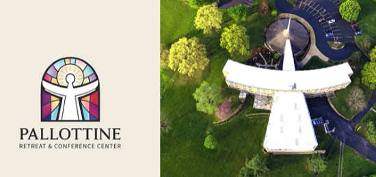
As part of a complete brand identity refresh, Pallottine Retreat and Conference Center – a ministry of the Pallottine Missionary Sisters in north St. Louis County – commissioned KPC to rethink the ministry’s longtime logo. As you can see, our designer was inspired by the shape of the primary grouping of buildings on Pallottine’s campus, as well as by the unique stained glass windows in the Pallottine chapel-in-the-round. The proposed fresh imagery was warmly received by Pallottine’s board and the Sisters; it recently was introduced to the public on Pallottine’s website. Soon, we will commence work on an integrated strategic marketing and communications plan for the ministry.
For six straight years, KPC has been honored to assist Kenrick-Glennon Seminary in St. Louis with its annual Christmas collection for the seminary. Each appeal has its own unique theme. This year we brainstormed with seminary leaders, who determined we would proceed with a theme of “Given & Received, Responding to His Love.” If you have supported the seminary with a financial gift in the past, you may already have received a mailing about this year’s collection. If not, be on the lookout during Advent for short seminarian video clips promoting the effort, each of which were shot and edited by the KPC team.
In the End, It’s Not About Us….
As noted at the top, KP Consulting Group is about more than graphic design. We can immerse as needed to collaborate as strategic thinkers as we tackle assignments and projects large and small.
We have done just that with numerous other Catholic ministries and organizations – from our work with NASPA, the National Association of Shrine and Pilgrimage Apostolate; to our unique immersion with Catholic Leadership Institute; to providing strategic counsel to the Catholic Campus Ministry Association; to our fruitful collaborations with the Diocese of Gary, the Diocese of Duluth, and so many others.
In the end, of course, we recognize that all of the efforts we undertake for the Catholic dioceses, parishes, ministries and organizations we serve really are not about us at all.
Two years ago, KPC was honored to produce a video for the Carmelite Sisters in St. Louis on the occasion of the 90th anniversary of their St. Agnes Home for seniors. One of our interviewees was Sr. Mary Joseph Heisler, DCJ, who sadly passed away a few months after we filmed her.
She said of the Sisters’ efforts at St. Agnes Home: “Our strength comes from knowing that it’s not our work…. It belongs to Him.”
Indeed, that’s how my colleagues and I think about our ongoing work at KPC. And we feel blessed.
How can we partner with you to do the Lord’s work – to awaken the hunger for Christ in our world – together?